
Book reviews are not something that I usually do on here, but whatever. I got a couple of books for xmas that I really enjoyed and I decided that I may as well pass along my thoughts for any like-minded people who may come across this and are looking for a good read. I had actually not even heard about this book. But B heard some design nerds say some good things about it and naturally thought that I would enjoy. She was right.
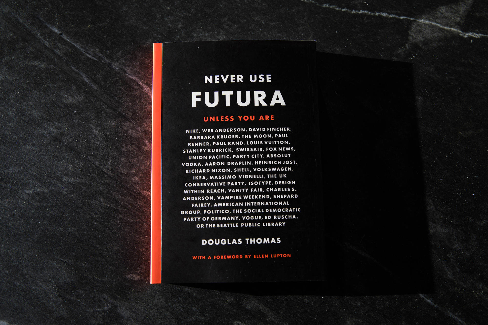
The book is a good mix of history, design, opinion, wit, and dry humor. I don’t even hold it against Douglas Thomas (the author) that he has affiliations with Brigham Young University. For those who don’t know me well, it is a pretty big deal for me to be able to overlook that fact, hehe. Futura is a typeface that was originally developed by a guy named Paul Renner and released in the late 1920s by the Bauer type foundry in Germany. In the past couple of decades, it has been popularized by the artist Barbra Kruger, then Shepard Fairey (as a nod to Kruger), and Supreme (as a blatant rip-off of Kruger).
Reading this book was like taking a guided tour through the museum of Futura. The text is pleasantly broken up by visual examples of the subject matter. Whether it is examples from old publications or overlaid examples of modern variations to illustrate distinction, the visual aides are always on point. It is one of those books where I couldn’t help but think the entire time I was reading “I wish that I knew as much about ANYTHING as Thomas does about Futura.”
It is a super easy and fun read, barely 200 pages. I read it in a single sitting, partly because I couldn’t put it down, partly because of its relatively short length. I would definitely recommend this book to anyone who is into design aesthetic, art and/or history.